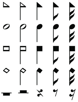
Sample treble clef symbols from different styles of music notation typeface designs, in progress. Releases planned in 2022 for use in Dorico, Finale, Sibelius, and other music scoring software.
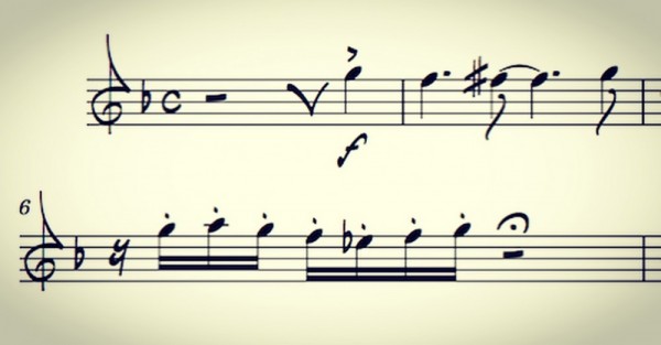
Early preview of a music notation font design shown at NAMM 2018 (including an alternate quarter rest symbol to match the design used for inspiration):
Collins, a bespoke music typeface for “The Sacred Harp: 2025 Edition”
A bespoke music typeface Jeff Kellem, Slanted Hall, designed for the songbook The Sacred Harp: 2025 Edition has recently been announced and named Collins. We first showed examples of the typeface and parts of the book at Camp Fasola in Alabama, 1 July 2025, and presented a class on the history of the book design. Surprised to see a queue waiting for autographs of the Collins Typeface Specimen 18″x12″ poster. Nice to see the good reception and how important the book and design is to the community.
From Introducing “Collins,” a New Shape-Note Music Typeface for The Sacred Harp: 2025 Edition (16 July 2025):
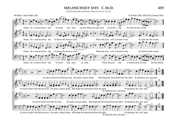
Kellem worked with a team of Sacred Harp singers with expertise in music typesetting and design to strike a perfect balance between tradition, readability, and elegance, marking the first time in our tunebook’s history that we as singers have been able to make our book and our notes look exactly the way we want. Each glyph was carefully designed to evoke the aesthetic of historical tunebooks while embracing the advantages of contemporary digital typesetting and printing. The notes are clear and easily distinguishable even in the densest pages of music—you’re going to be amazed when you see “Bear Creek” (p. 269)!
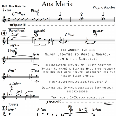
Music Notation Font Conversion from SMuFL to Sibelius
Philip Rothman wrote in the announcement for the full project release of the Pori music notation fonts and Norfolk chord symbol font updates:
As the resident font professional on this project, Jeff Kellem of Slanted Hall Type Foundry has devoted countless hours to it. No detail was too small for him to overlook as the revisions numbered into the hundreds. He built the entire Pori suite and also built the Pori, Norfolk, and Norfolk chord symbol fonts. Although he will insist that this was a font engineering project and not a type design project per se, his skill is evident everywhere. Making these fonts work seamlessly in Sibelius was a special challenge, and I’m so glad that Jeff was up for the task and all of the twists and turns it took along the way.